Brand IdentityPackaging Design
Verdant Organics
An organic ready-meal kitchen with fiercely loyal locals and packaging that looked like everyone else's. We built a farm-fresh identity that works as hard in the chiller as it does on a delivery bike.
CLIENT
Verdant Organics
SECTOR
Food & Organics
YEAR
2024
SCOPE
Identity + Bowl Packs
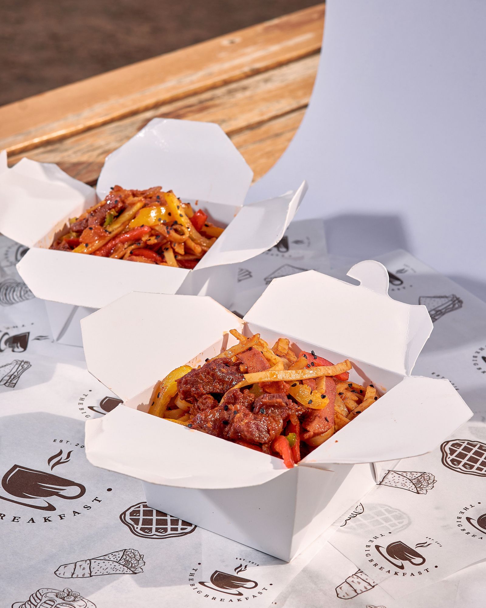
Fresh Food, Freezer-Aisle Looks
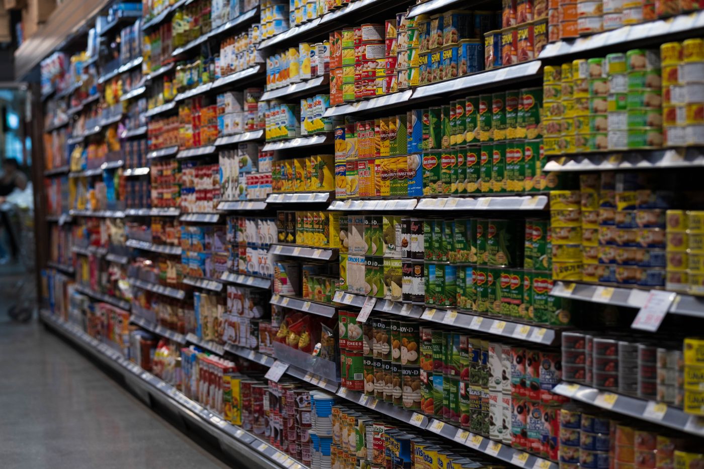
Verdant cooked in small batches every morning, but its bowls wore stock photography and a forgettable green badge. Shoppers assumed long-life and additives — the exact opposite of the truth — and the range blended into the very aisle it wanted to disrupt.
Show The Food, Name The Farm
We put appetite first: full-bleed bowl photography shot in one daylight session, with the farm name and harvest date printed on every sleeve. A hand-drawn leaf mark and honest typography keep the range feeling market-fresh rather than mass-produced.
What We Delivered
- Identity & illustration — leaf mark, market-fresh type pairing, and sleeve illustration set.
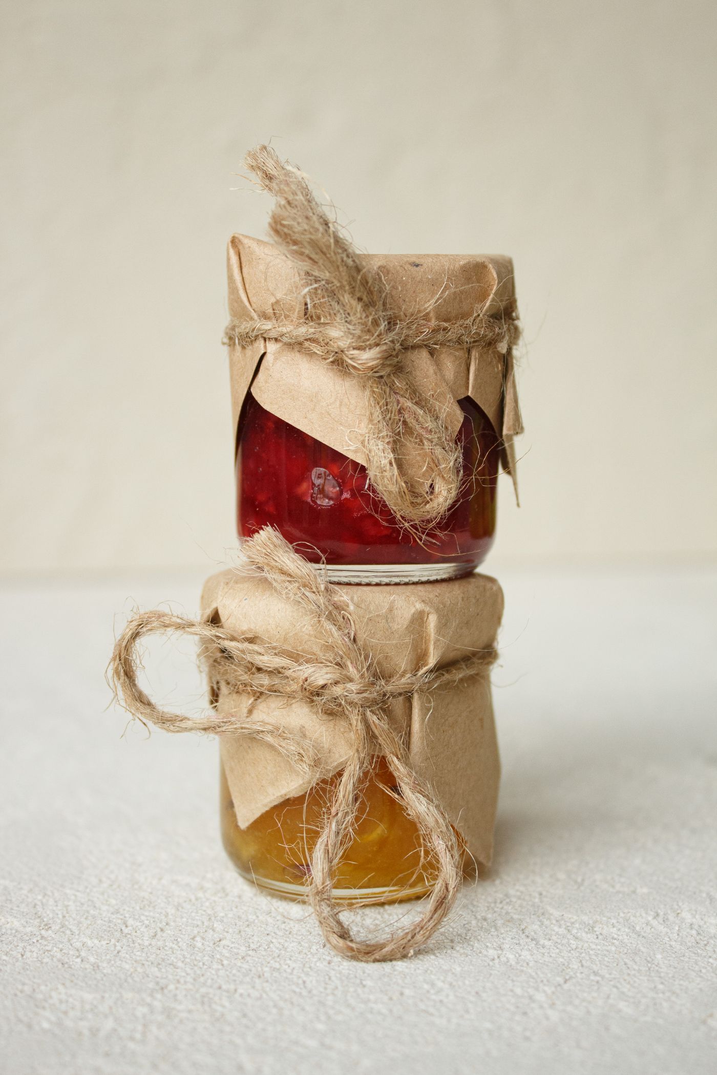
- Bowl & jar packaging — nine SKUs with appetite-first photography direction.
- Provenance system — farm-name and harvest-date panels built into every label.
- Market stall kit — banners, sampling cups, and chalkboard templates.
The Outcome
Verdant's bowls are now the brightest thing in every chiller they enter, and shoppers finally read them correctly — fresh, local, traceable. The kitchen has since added a jarred-soup line using the same system without any redesign work, and market-stall sampling queues regularly sell out the day's stock.
Related services: Brand Identity Systems, Art Direction.
Start Your Project