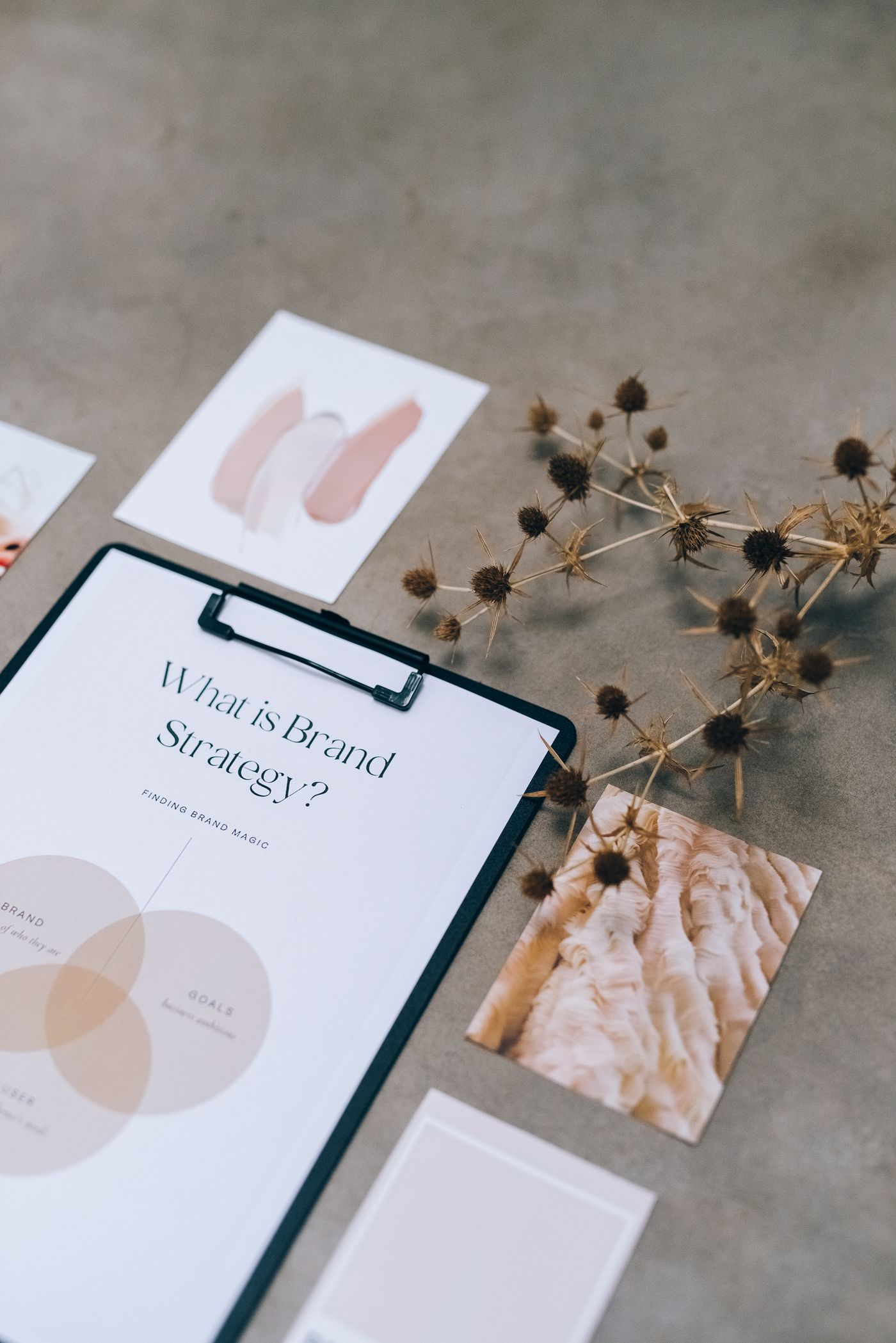
Brand strategy board flat lay

Brand Identity · January 2026 · 5 min read

Building Brand Identities That Stand The Test

Trends are tempting. A new type style sweeps through the feeds, every launch starts to look the same, and suddenly your pack feels dated before the first reprint. Longevity comes from a different place: a clear idea about who you serve and why you matter. When that idea sits at the centre, colour palettes and typography become expressions of something stable rather than decoration chasing the season. That is the difference between a look and an identity.

A lasting identity is a system, not a single lockup. It defines how the logo behaves at twelve millimetres on a seal, how the palette stretches across six flavours without breaking, and how photography, illustration, and voice all pull in the same direction. We document those rules in plain language so printers, partners, and future hires reproduce the brand faithfully. Constraints sound limiting, but they are what keep a brand recognisable for a decade instead of a season.

If you want your own identity to age well, start with restraint. Choose one idea, one workhorse typeface pairing, and a palette with room to grow, then test everything at real sizes — the barcode panel, the foil seal, the phone screen. Ask whether each element earns its place or merely fills space. Brands that survive are rarely the loudest on the shelf; they are the clearest, the most consistent, and the easiest to remember.
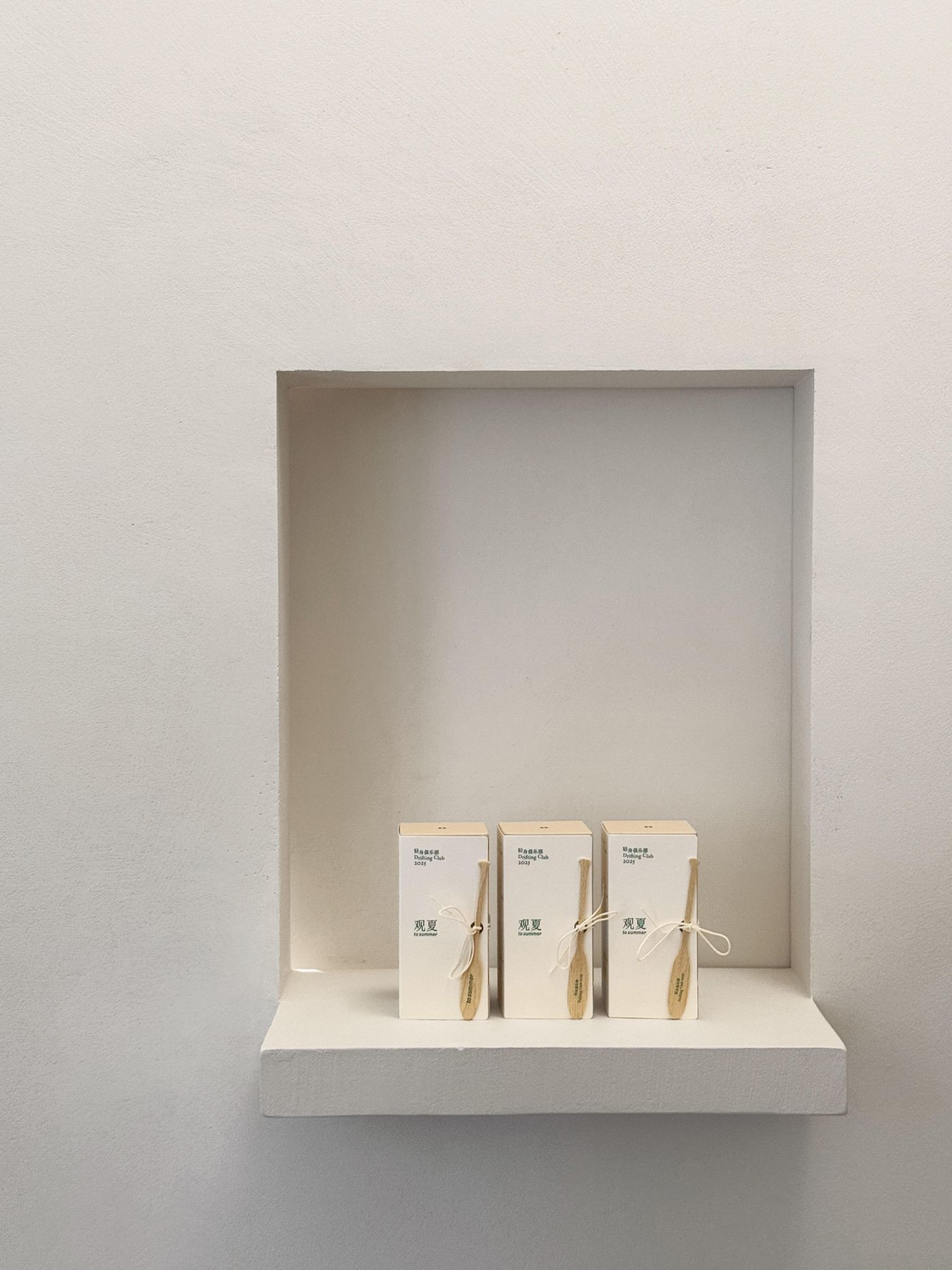
Boxed products on a white shelf

Packaging Design · February 2026 · 5 min read

Creating Shelf Impact Through Strategic Packaging

Shoppers decide in seconds. Research consistently shows the in-aisle choice happens in under five, with most of it below conscious thought — colour blocks, familiar shapes, and one readable promise do the persuading long before ingredients get a glance. That means hierarchy is strategy: decide the single thing each pack must say at three metres, then protect that message from every competing claim, badge, and burst fighting for the same square centimetres.

Structure and material speak before graphics do. A tall slim bottle reads premium beside squat jars; matte finishes invite touch while gloss shouts value; a distinctive closure or pouring lip can become the brand mark shoppers recognise blind. We prototype in three dimensions early — plain mockups on a real shelf, photographed from the aisle — because a design that sings on screen can disappear among neighbours. Shelf context is the only review that matters.

Finally, test with strangers, not stakeholders. Five honest minutes with someone who has never seen the brand reveals what the team can no longer see: the flavour variant that reads as a different product, the claim nobody believes, the back panel nobody can find. Fold those findings into one focused revision round rather than endless tweaks. Impact is not louder packaging — it is packaging that gets understood, remembered, and reached for.

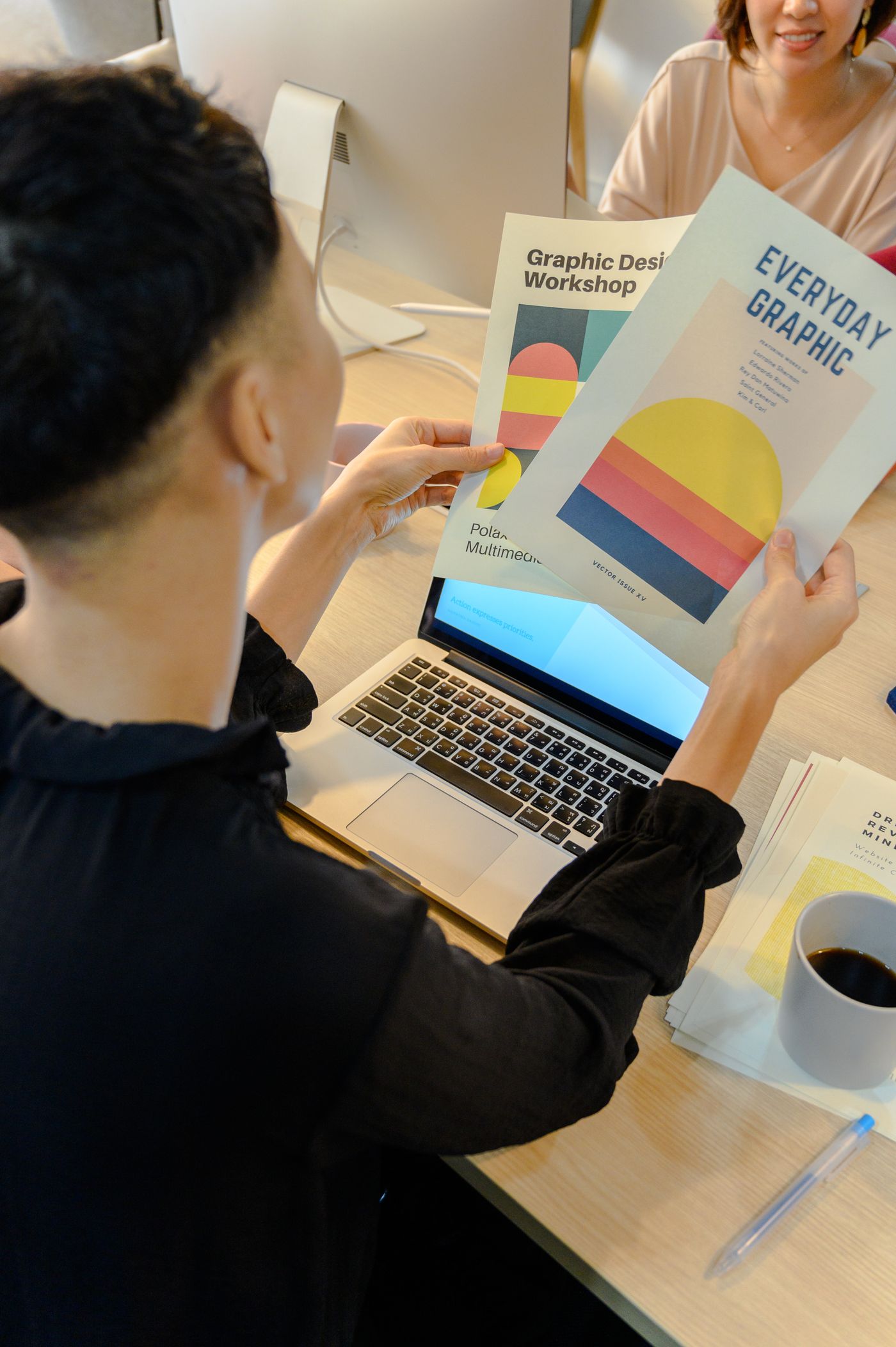
Designer reviewing printed layouts beside a laptop

Creative Strategy · March 2026 · 5 min read

Research Methods For Better Branding Outcomes

Good research is smaller than most teams fear and more useful than most expect. You do not need a hundred respondents to learn something real; six well-chosen conversations with actual buyers will surface the language they use, the frustrations they carry, and the moment your category actually matters in their week. We start every project by listening — to founders, to stockists, and above all to the people reaching past competitors to choose.

The shelf audit is our favourite method because it costs nothing and humbles everyone. Photograph your category across three different shops, print the images, and mark where the eye lands first — then be honest about whether your pack earns any of that attention. Pair it with a five-second test: show the design briefly, hide it, and ask what people remember. What survives that test is your real brand; everything else is decoration.

Close the loop by turning findings into one page of decisions. Research fails when it becomes a binder nobody opens; it succeeds when it becomes three sentences the whole team can repeat — who we serve, what we promise, and what we will never do. Pin that page above every sketch and every proof. Months later, when opinions multiply and deadlines press, it will settle more arguments than any meeting.

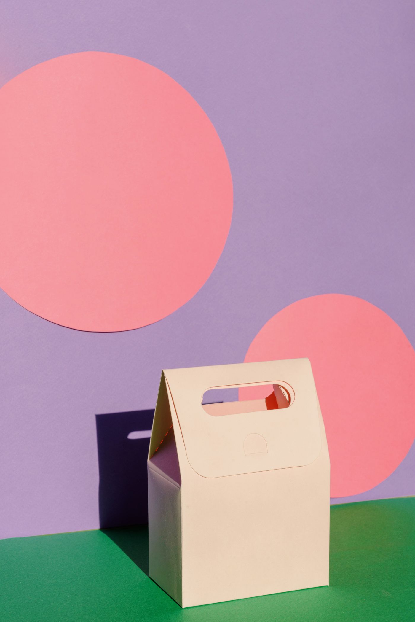
Pastel carry box on a coloured backdrop

Packaging Design · April 2026 · 5 min read

Balancing Functionality And Beauty In Packaging

The prettiest pack on the shelf is worthless if it leaks, crushes, or confuses. Function sets the boundaries every beautiful idea must respect: barrier properties, fill lines, transit stacking, portioning, resealability, and the legal panels no designer can negotiate away. We map those constraints before drawing anything, because creativity thrives on an honest brief — the tightest dieline often produces the most distinctive design. Beauty that ignores physics ends as an expensive recall.

Beauty, meanwhile, is not the opposite of function — it is function aimed at humans. A clear dosing cap reduces waste; a readable hierarchy saves a busy parent time; a pack that opens one-handed on a train earns loyalty no advertising can buy. When we style photography, finishes, and unboxing moments, each choice must pass the same test: does this make the product easier to buy, use, or enjoy? If not, it goes.

The balance is found in prototyping, not debating. Fill it, drop it, ship it across the country, leave it in a warm car — then look at what survived and refine. We run at least one physical round before final artwork, because screens forgive what shelves punish. The goal is a pack customers admire in the hand and never have to think about in use. That quiet reliability is the deepest form of beauty packaging can offer.

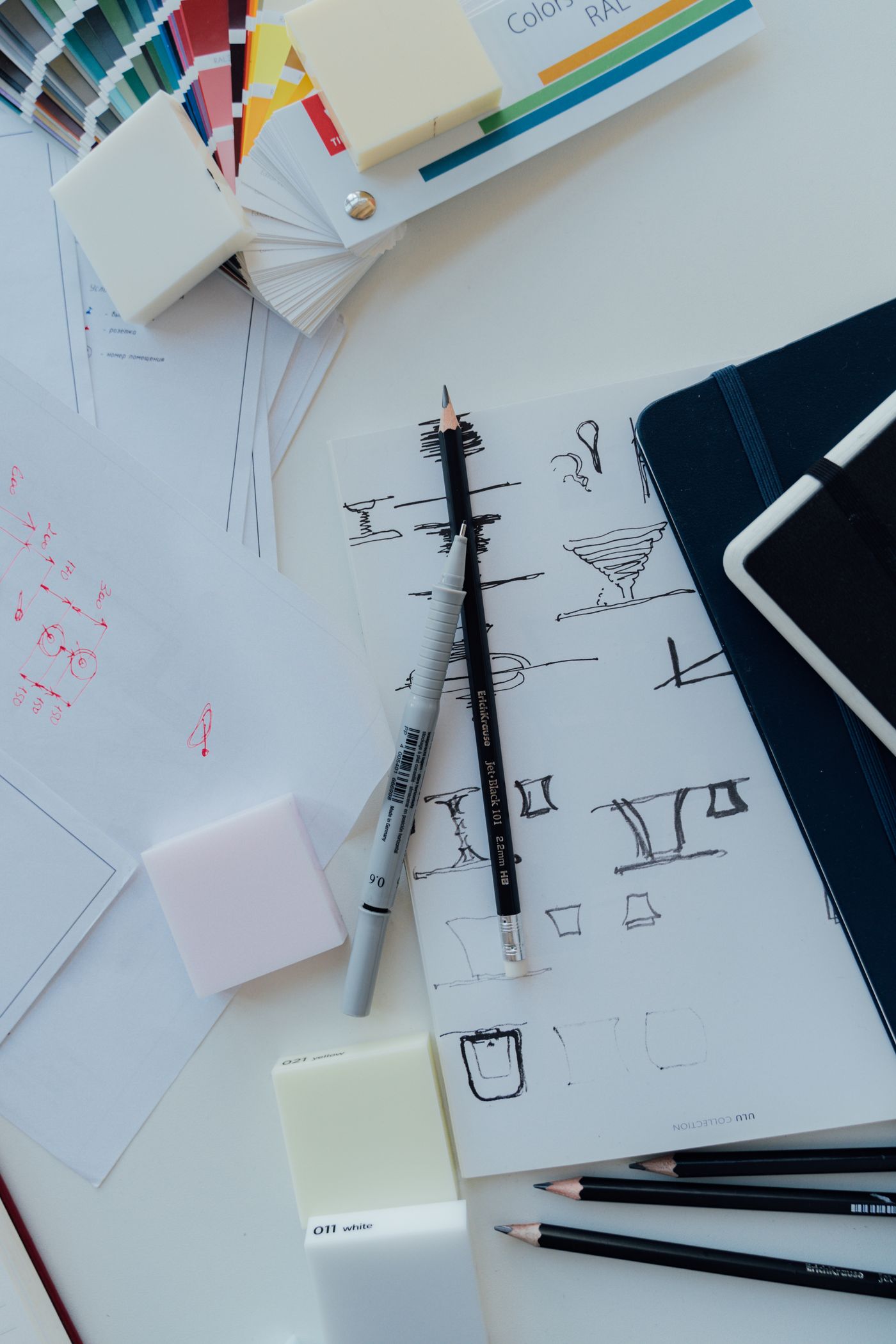
Sketches and colour swatches on a desk

Creative Strategy · May 2026 · 5 min read

How Creative Direction Shapes Brand Perception

Customers never see your strategy deck — they see photographs, shelves, parcels, and feeds, and from those fragments they assemble the whole of your brand. Creative direction is the discipline of making every fragment agree: the same light, the same palette, the same attitude whether the touchpoint is a market stall or a phone screen. Inconsistency reads as carelessness; coherence reads as quality, before a single word is read. That first impression forms in under a second.

Direction starts with constraints, not cameras. We define the world first — three adjectives the brand owns, a palette with room for seasons, rules for props, casting, and retouching — then hand photographers and stylists a brief they can genuinely follow. Reference boards beat mood adjectives every time: show the exact morning light, the exact worn timber, the exact hand with unpolished nails. Specificity is what makes separate shoots feel like one brand.

Protect the system after launch and it compounds. Review new assets against the original boards quarterly, retire what drifts, and refresh props before they date — small discipline, large payoff. Brands with strong direction spend less over time because every shoot, post, and pack starts halfway finished. Start with one clear world and defend it kindly but firmly. Consistency, repeated for years, is what turns recognition into trust.

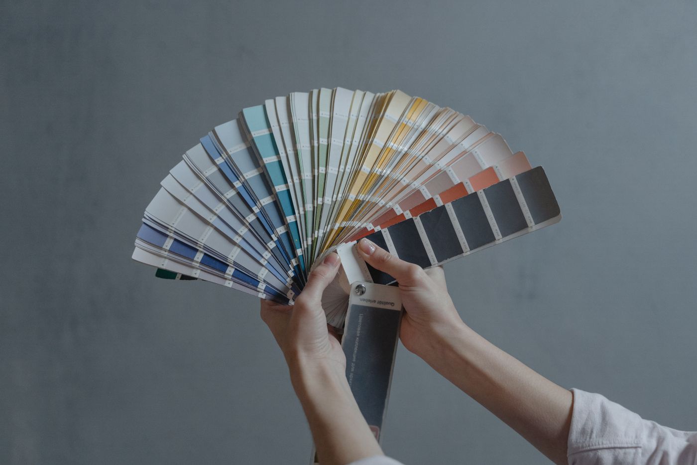
Hands holding a colour swatch fan

Brand Identity · June 2026 · 5 min read

Essential Elements Of A Cohesive Brand System

Cohesion is what separates a brand from a collection of nice designs. It comes from a handful of elements working overtime: a logo suite with responsive variants, one or two typefaces with clear roles, a palette where every colour knows its job, and a voice that sounds like the same person whether it writes a headline or a returns label. Miss any one of these and the system wobbles; hold them all and everything else gets easier.

Guidelines turn those elements into a system other people can actually use. The best rulebooks are short, visual, and honest about real life — they show the minimum sizes, the spacing, the don'ts, and crucially the approved shortcuts for awkward formats like favicons, till receipts, and embroidered aprons. A guideline nobody opens is decoration; one page that answers the printer's Friday-afternoon question is infrastructure. Write for the busiest person who will ever use it.

Finally, cohesion needs a keeper. Systems decay the moment nobody owns them — a new supplier improvises, a campaign invents a seventh colour, and suddenly the shelf tells three stories. Nominate one person to approve new applications, run a short annual audit, and prune what no longer serves. Brands are not finished at launch; they are maintained, the way gardens are, season after season. That steady care is invisible to customers and unmistakable in its effect.

Have a story worth packaging well?

Tell us what you're making — we'll show you what it could look like.

Start Your Project