Brand IdentityPackaging Design
Aurelia Skincare
A botanical skincare startup needed an identity as fresh as its formulas — and a tube range that could hold its own against heritage brands three times its price.
CLIENT
Aurelia Skincare
SECTOR
Beauty & Skincare
YEAR
2025
SCOPE
Identity + Packaging
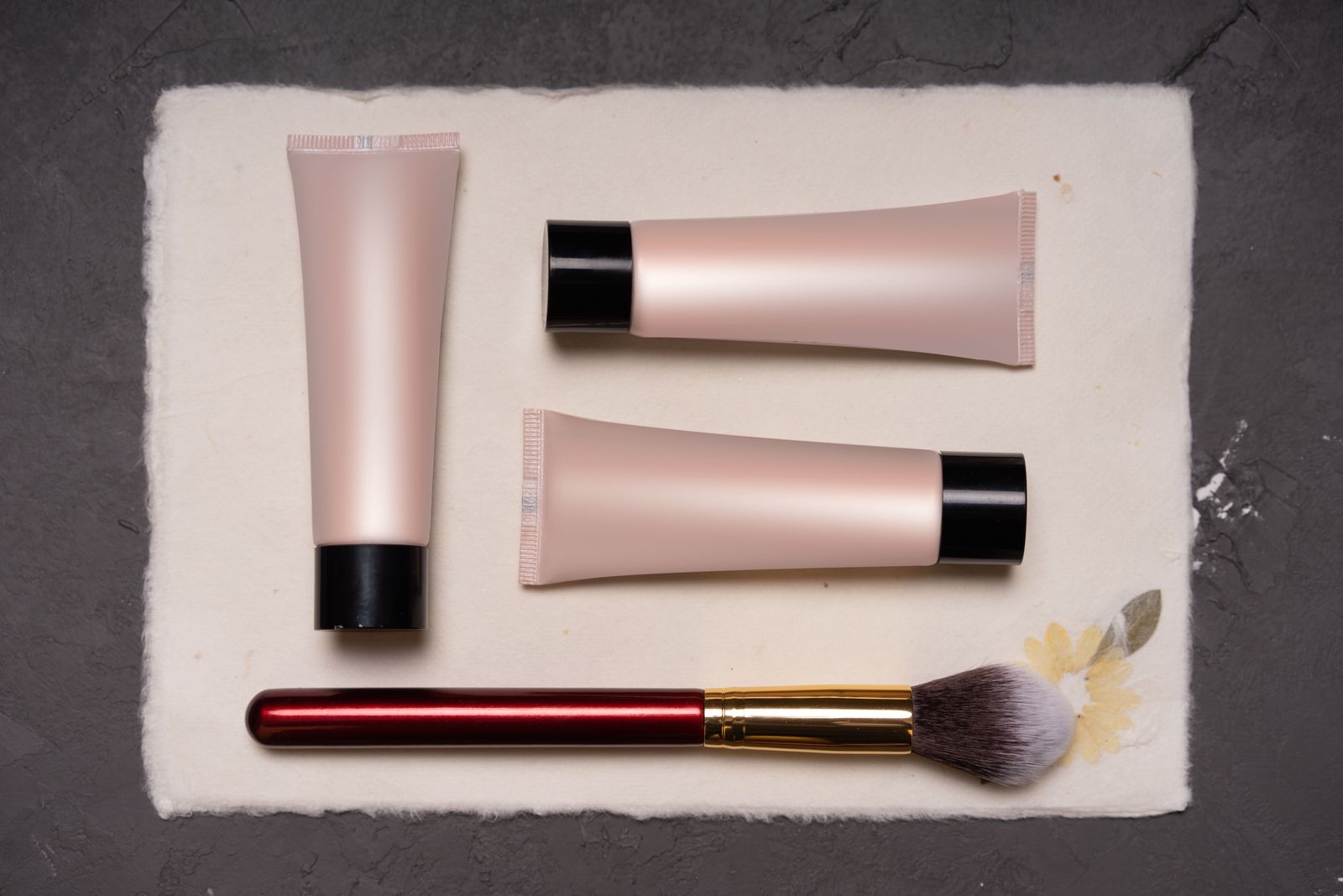
Standing Out In A Crowded Bathroom Cabinet
Aurelia's formulas were genuinely distinctive — cold-pressed botanicals, refillable tubes — but its launch look whispered. On a shelf of minimalist beige, the brand disappeared; online, its thumbnails blurred together. The founders needed colour confidence without losing credibility.
Colour With A System Behind It
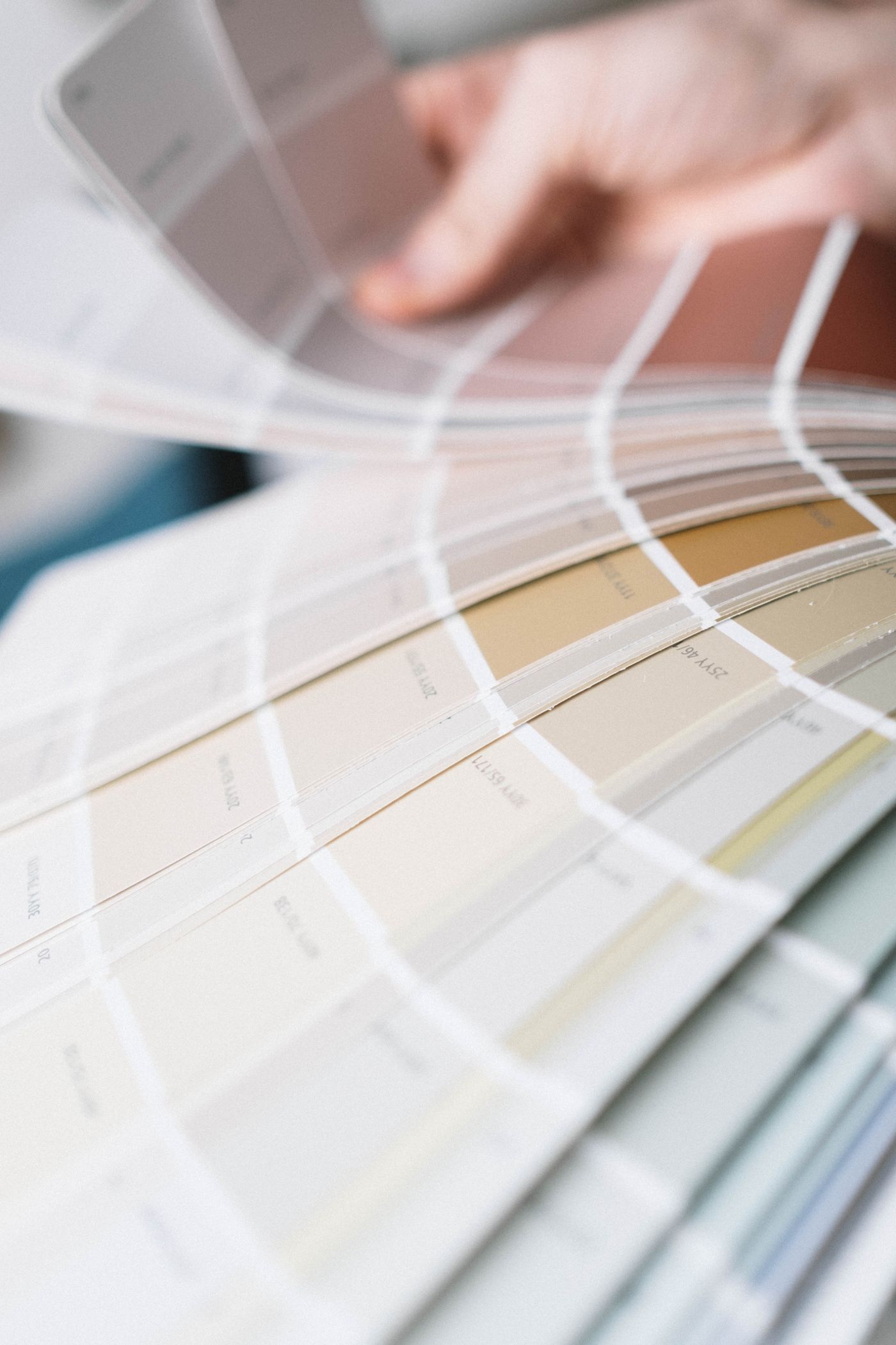
We gave each product family its own bold hue inside one disciplined architecture — same wordmark, same ingredient typography, same cap colour logic. Playful at first glance, precise on inspection. Refill pouches were designed alongside the tubes so the sustainable story reads instantly.
What We Delivered
- Identity system — wordmark, monogram, type pairing, and five family colours.
- Tube & pouch packaging — twelve SKUs with print-ready artwork and finish specs.
- Guideline document — a 24-page rulebook for Aurelia's in-house team.
- Launch social kit — templates for announcements, rituals, and restocks.
The Outcome
Aurelia launched into forty independent retailers with packaging the buyers photographed for their own social channels — the range now anchors the brand's window displays. The founders report that stockists reorder the full colour wall rather than single bestsellers, and the refill pouches outsell projections.
Related services: Brand Identity Systems, Label & Packaging Design.
Start Your Project